In 2021 appeared a new CSS trick which is called the flexbox gap.
This property is borrowed from Grid CSS and is called grid-gap. The gap is used to create space between cells. Let’s see how this property works in a regular CSS grid:
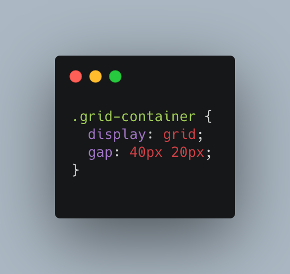
As a result, we get the following grid:
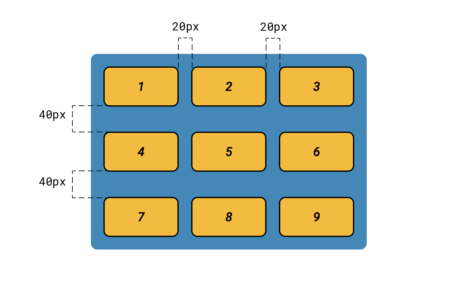
There will be a distance of 20px between columns, 40px between lines.
Flexbox without a gap
Flex-box has been around for a long time, as it removes the need for negative margins. To add space between elements, you need to add a margin property to each of them:
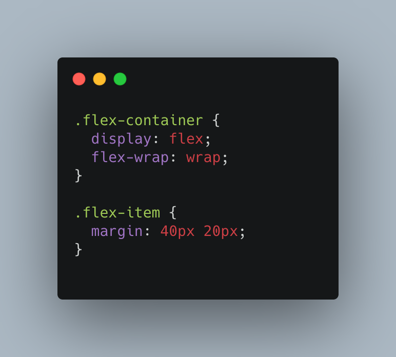
But with this approach, an undesirable effect appears - empty space also appears between the elements and the edges of the container. This is very inconvenient if all elements must be positioned from edge to edge according to the designs.
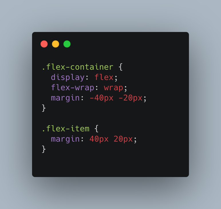
In order to remove unwanted extra space, you need to add a negative margin to the container:
Flexbox gap to the rescue
The new row-gap and column-gap properties make things much easier. It will be enough to specify from the value in the container styles in order to expand the flex items:
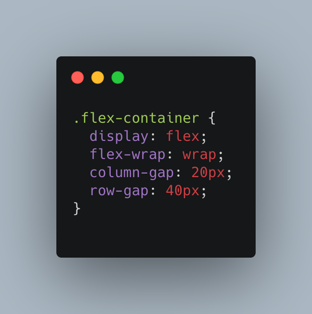
As with the grid, the entry can be shortened slightly by using the gap property: gap: 40px 20px;.
No more negative margins and unwanted margins.
What’s the catch?
The use of this property for flex containers is currently limited. At the time of this writing, only 68% of browsers support this property. This is quite small for a widespread use of the flexbox gap, but hopefully this changes soon.